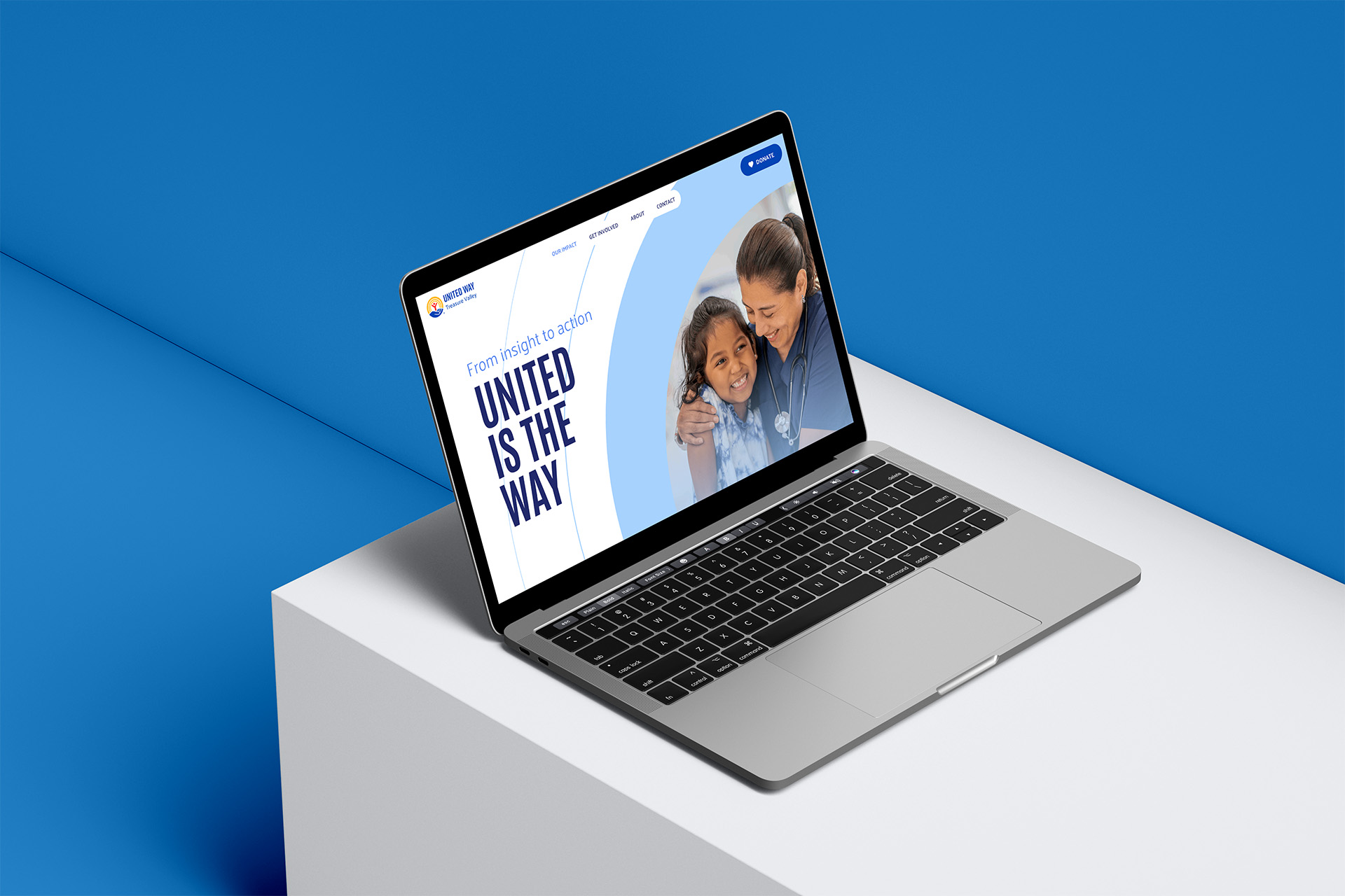
I led the strategy and client-side creative direction for a complete redesign of United Way of Treasure Valley’s website, partnering with Reynolds + Myers (R+M) on design, copy, and custom WordPress development. My role included the project brief, sitemap and information architecture, messaging and brand direction, stakeholder coordination, creative review and approval, image selection, launch, and ongoing site management.
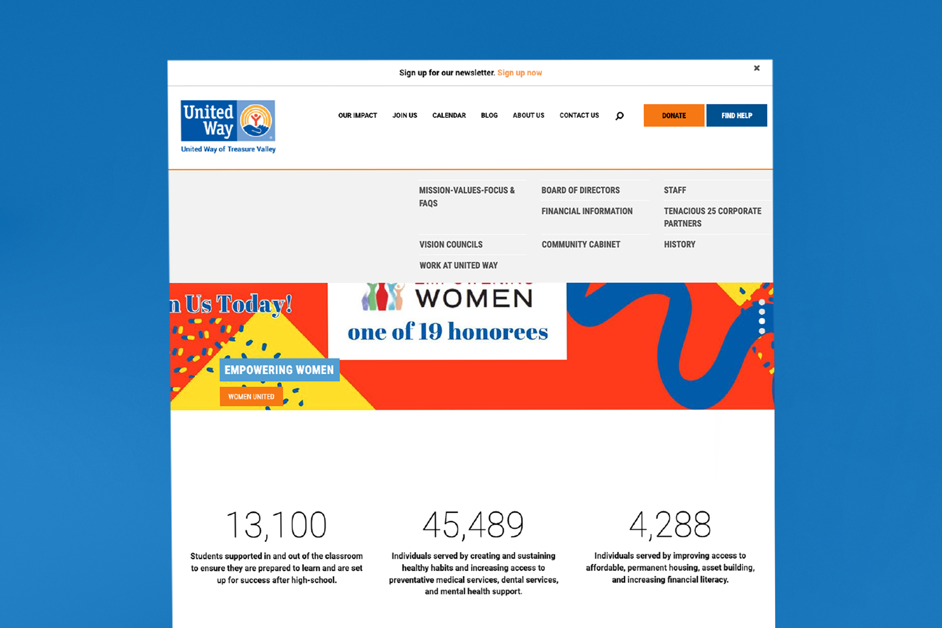
Our previous site had become difficult to maintain and overloaded with programs, resources, and organizational information. It was built on an outdated platform which was made even small updates cumbersome.
The redesign started with a more fundamental question: who is the website actually for? I led an internal shift away from treating the site as a place to store everything we wanted to say and toward designing it around what donors, partners, and other visitors needed to understand and do. That led to a dramatically simplified sitemap, fewer strategic navigation paths, clearer storytelling, and a stronger path toward engagement and giving.

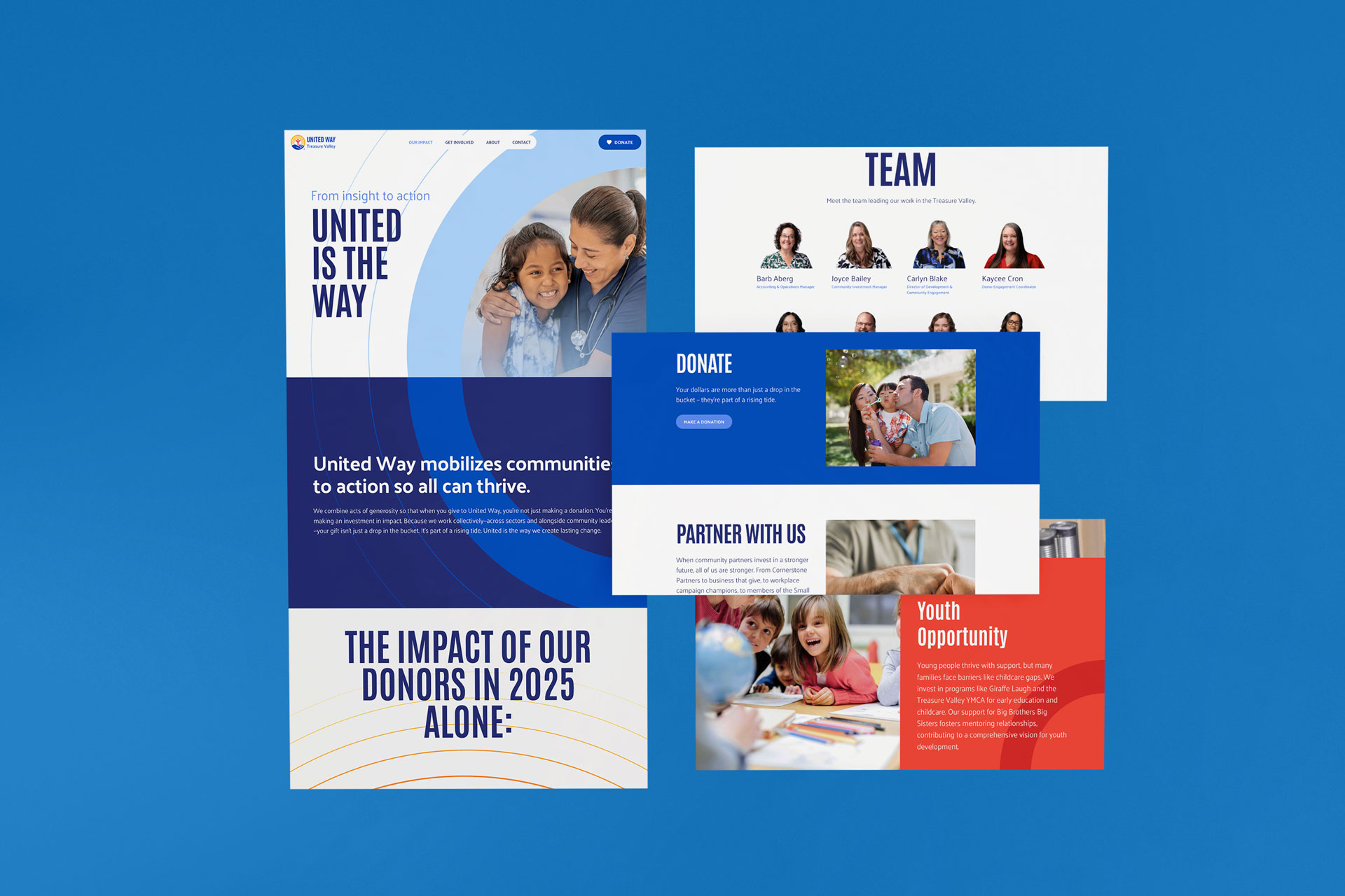
The redesign also moved us to WordPress and brought the site into alignment with United Way’s refreshed global brand. R+M translated the strategy and brand direction into the final visual design and custom build. I served as the primary client-side lead, reviewing concepts, providing creative direction, and making final decisions throughout the process.
A major goal was creating a site we could actually manage ourselves. That was tested only weeks after launch, when a federal funding crisis created a fast-moving need for clear, constantly updated public information.
I was able to quickly build and maintain a dedicated landing page that became a central source for partners, media, and community members throughout the situation. The crisis received significant local media attention, and having one reliable, continually updated source gave reporters and partners a clear place to verify information, understand what had changed, and know who to contact as the situation evolved. It helped our team respond in real time and communicate with greater confidence during an urgent and uncertain moment. Our federal funding was ultimately restored.
The project became an important moment in how our team understands and communicates who we are, what we do, and what we choose to put forward. I approached the website as one deliberate tool in a broader effort to sharpen our communications posture, and the process pushed us to be more intentional about our story, our priorities, and the role each piece of content should play.
That thinking has continued to shape our broader communications work. Content is more focused, updates are faster, and the platform can respond to emerging needs without relying on outside development. The website is now one of the clearest expressions of how we want people to understand United Way: clear, useful, current, and grounded in the work itself.
My role: Strategy, brief, information architecture, messaging direction, client-side creative direction, stakeholder coordination, creative review and approval, image selection, launch, ongoing site management.
Reynolds + Myers: UX and visual design, copy development, and custom WordPress development, and general awesomeness (they are always so wonderful to work with).